Colour runs deep in our psyche at both a conscious and a subconscious level and every day colour influences our choices. It has the power to soothe and even irritate our body and mind. This is especially true for babies and young children, who can be very sensitive to colour so it’s important that you make wise colour decisions when it comes to decorating a room for your little one.
We’ve spoken to applied colour psychology specialist, Karen Haller, who has shared her dos and don’ts of using colour when it comes to decorating a nursery or a bedroom for your child.
Use pastel colours
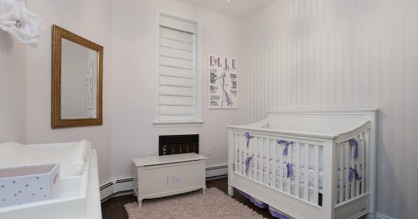
A good night’s sleep can leave you feeling refreshed and alert, but getting some decent shut-eye doesn’t come easy for everyone, especially new-borns who will wake up constantly throughout the night crying for their parents. To help keep your child calm and settled paint or wallpaper their room in soft pastel colours as this will soothe rather than stimulate or irritate them. If you are decorating a room for your baby without knowing the gender, or even if you do know the sex of your baby and you just want to break away from the stereotype that pink is for girls and blue is for boys then Karen recommends that you paint or wallpaper their room with colours such as pastel greens, lilacs and violets (try Violette by Colours).
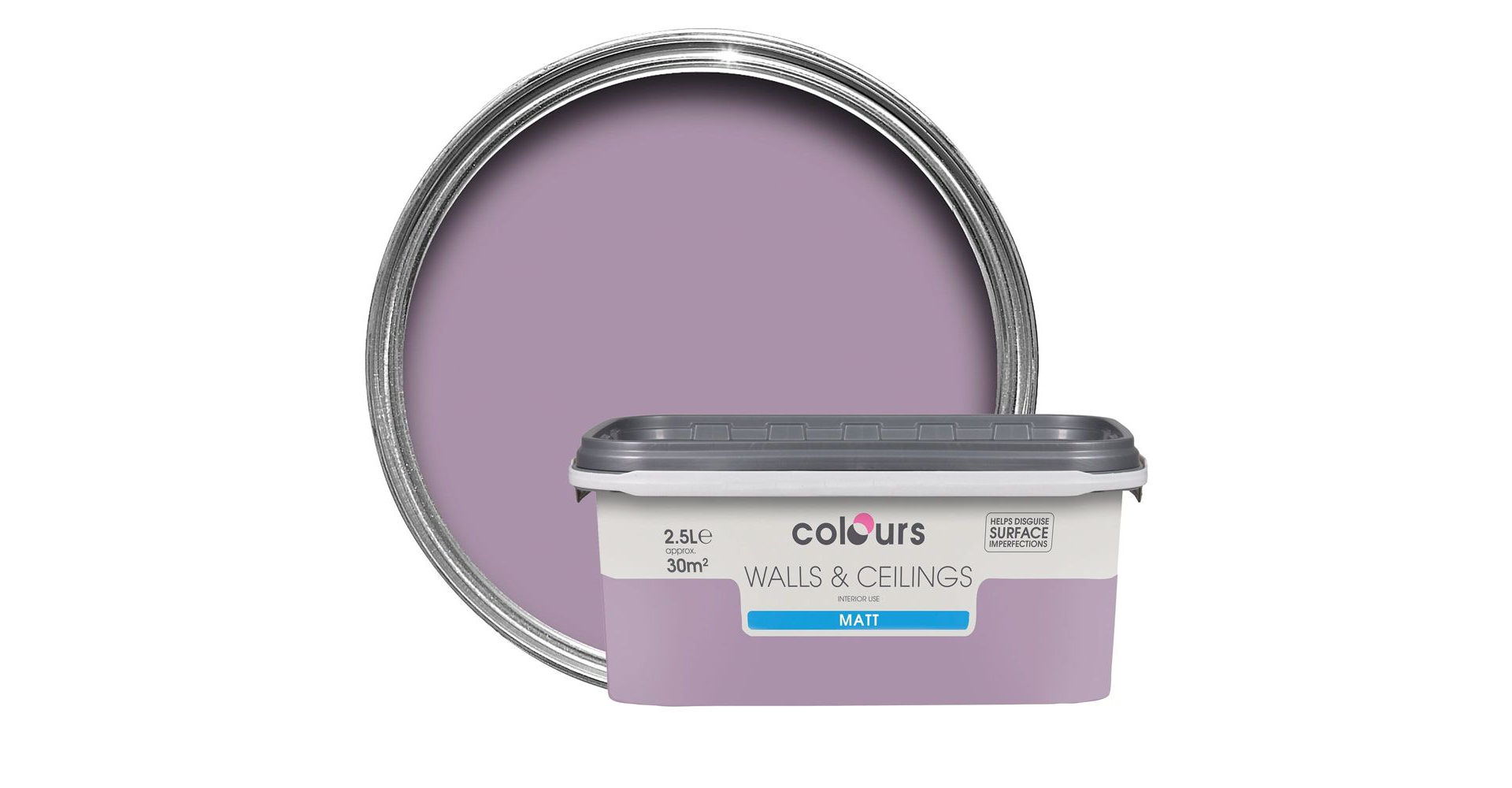
B&Q Colours Violette Matt Emulsion Paint
If you favour green, Karen suggests that you use a warm pastel tone (opt for Fresh Sage or Willow Tree by Dulux) as “green is the colour of universal love, love of the planet, love of the universe and love of nature, harmony and balance,” she says. However, she advises that it’s best to avoid richer tones such as emerald greens, dark bottle greens and especially lime green as lime green has a high percentage of yellow making it a very vivid colour. “The colour that you also absolutely avoid is yellow, as yellow stimulates the nervous system and a child cannot sleep if their nervous system is being kept awake,” she adds.
Another colour that Karen believes is absolutely disastrous for babies and young children is brilliant white. “You would also want to completely stay away from brilliant white which is the only colour that’s man-made, every other colour even fluorescent colours are found in nature,” she says. Every day we are breaking down and absorbing our surroundings but Karen says: “Our body cannot physically and mentally in anyway collaborate brilliant white because it’s manmade, so it’s always jarring against us and it’s a very, very cold white.” However, warm whites such as ivory white would make a much better alternative to the stark brilliant white.
Proportions
Now that you’ve got your colours sorted it’s vital that you think about the proportions in which you use them and the placement of them as too much of a colour or where it’s placed can leave you feeling adverse effects. “The amount used can tip someone from feeling the colour in a positive way or an adverse way…You’ll always want to create a positive response to colour,” Karen says. The proportions in which you use colour will depend on the size of your space, the purpose, who’s going to be using the space and how you want them to feel and behave. When it comes to decorating a room for your child, it’s also important to remember that you can inject further personality and touches of colour into their room with accessories such as soft toys, cushions and shelves.
We would love to see and hear your thoughts on this topic – send us over some pictures of your child’s nursery or bedroom via Facebook and Twitter.
Image taken from Bad Neighborhood (www.paintzen.com, www.paintzen.com/commercial & www.paintzen.com/residential)